Thesis Proposal Preparation

How has the relationship between Illustration and Graphic design changed since the creation of digital production?

Or

How has the digital world influenced the change in illustration?

Or

Is the digitalization of illustration marking the end of traditional illustration?


I will need to narrow down a period of time that fits the “creation of digital production”

I will need to look into the history and fundamentals of both Illustration and Graphic design

Then compare it to how both of the disciplines work now

Also look at how the relationships between the two have changed in detail


” The discipline of illustration os constantly expanding. it is an elastic art form which successfully stretches to wherever its varied practitioners wish to take it, illuminating text, decorating products, commenting on society, making statements as public art on walls, entertaining gamers and film viewers and persuading consumers.”

-Becoming a successful illustrator


Dinotales

Dinotales are a little series of children’s books I have been working on for a project. They are to educate very young children about relationships, love and growing up. Normally I don’t enjoy social design as it has never really been my thing. So when I got given education as the theme for my social design project, I knew I had to turn it into something I really enjoyed to get me through the unit. I love drawing and I love dinosaurs. Recipe for fun or disaster? Funnily enough, this has ended up being not only one of my favourite projects, but also maybe my most rewarding. In just a few weeks I have been submerged into the world of children’s books and I don’t want to leave. This really could be for me. Telling funny stories and drawing little doodles every day? Where do I sign up?

On a more serious note, it really has taught me a lot about not only the craft of all it entails but about myself too. I have managed to buy a graphic tablet, learn how to use it, draw and design 12 characters, produce 5 narratives for 5 books, lay them out and get them printed and bound in just under 6 weeks. If you told me I would do that last year I would have laughed. Anyone who thinks university is a waste of time and money, they could not be more wrong. Nothing has made me grow up and realise my potential more.

The outcome??? Something I am very fucking proud of and will be keeping for my kids.

29115228

Thesis Proposal…working progress

More of the same. At the same time as writing my Self Initiated Project Proposals, I have to also write a Thesis Proposal. This is basically 2,500 words proposing what you will write your 10,000 word thesis on next year. What you have chosen, how you will approach it, from what angle, how you will gather the research and what you will look at. Lets also not forget that this is art school so not only do you have to write the fucking thing, you also have to design it. Thus in my proposal I have to talk about what kind of design would be appropriate with the subject and question I have chosen, as well as how it will be printed and bound.

I have always been an avid drawer and in turn always been interested in Illustration. At one point I was stuck between doing a degree in Graphic design and doing one in Illusttration. I feel now is my time to really explore both and find out the big differences and similarities between the two. My initial research question was “What are the essential differences between Graphic design and Illustration?”

Now upon reflection and talking to others deciding  on their thesis questions, I know it needs to be more focused. I am interested in the history of the two but also how they have advanced on each other over the years. I am now considering such questions as:

“Has Illustration as an industry caught up to that of Graphic Design?”


“How does ‘Authorship’ take a place in the relationship between Illustrator and Graphic Designer?”

“What difference do they play in terms of a degree? What does each offer?”

“How could you differentiate the subjects in terms of history?”

“How does the role of communication play a part in both? is it different enough?”


“How has illustration changed?”

“Has the birth of digitalisation within illustration defined the end of traditional illustration?Or does it then become graphic design?”

“What are their rules what are their guidelines to stop the two merging?”


“Illustration has taken a beating but now after the digitalisation, could it be considered more effective, powerful and mouldable than graphic design?”


For me graphic design is constricted. There are rules, things to follow and things not to do. You are meant to push these rules, bend the rules and break these rules, but if you get it wrong then its a graphic design no no and how dare you break the rules?

Whereas illustration is a lot freer and as much as you still follow an idea of what the client wants.. there are no specific rules that say don’t make a mans head bigger than his body. It is for people who are a little chaotic and imaginative whereas graphic designers pour themselves over white spaces and the fear of using them. Graphic design is for the OCD and the neat freaks.

Self Initiated Project Proposals

Design and write three briefs for three potential projects you would like to undertake. Yes that sounds easy. It’s hard enough receiving a brief I haven’t written and creating a project out of it, let alone creating three specific avenues I want to explore. The hardest part is you are doing these projects next year not now, so as well as being an author you have to be a time traveller. I have to somehow look a year into the future and design a brief with those interests in mind. For some people this is the dream, it allows complete creative control and freedom. For me this is a nightmare. I don’t have the decisive capability to decide what I want for dinner let alone decide my design future. None the less, life gives you lemons, Fuck the lemons.

1

Natural as Fuck                                                                                                                                                   Design and brand a natural food company. This will entail defining a complete and rounded brand identity as well as designing all their mercy, packaging and logo.  I have always been interested in raw natural materials apposed to the traditional white space loving graphic designer. Don’t get me wrong I love a bit of empty space, everyones eyes need space to breath but I am also a lover of chaos and roughness. I am interested at looking into recycled materials and fabrics that I can source to create an entirely new brand out of these unwanted pieces. I will need to look into brands that already do this to see where I think I can improve. I will need to consider the clientele , I will need to work with a consistent and appropriate colour palette. This project will take experimentation, time, persistence and refinement. It is also in an area I am not particularly fond of  (branding) so will really challenge me as well as giving me a taste of what working in the industry to a brief you don’t like can entail. However, I am not silly enough to create an entire project that I don’t like the sound of. With the theme of natural foods and found resources and materials, my project will allow me to delve into the context of a rough and unfiltered world allowing a place and outlet for a massive passion of mine…hand drawn letting and brush type. I will be looking into people like Gemma O’Brien and Jucy Lu.

Key themes: Raw, natural, branding, hand made, experimentation, brush typography, clean, refinement, colours.

2

Educating the tiny humans                                                                                                                                     Design a children’s book. This should be used as a tool to educate young children. The age group will be set to primary school, leaving within it space for me to decided closer to the time whether I want to focus on the younger or older portion of that category. I will need to consider all elements of producing and designing a children’s book for example writing the content, (narrative) producing the illustrations, designing the entire layout and organising the number of pages. Then I will also have to consider the finishing: cover design and finish, printing, binding and packaging. Its a detailed brief that entails a lot of attention to detail and a lot of elements to consider so I will need at least ten weeks to design and produce the entire book. I think it will challenge me in terms of the content and target audience. The brain of a small child isn’t where we place ourselves very often. I want to outcome to be educational so it will need to focus on a lesson that is appropriate to children like relationships or sharing. However, it will also need to be simple enough that the message gets across as well as being visually pleasing enough to hold a child’s focus. My main reason for this brief is previous enjoyment. Over the course of this last term I have been creating a little series of children’s books about Dinosaurs. There are five in total and they all deal with issues to do with relationships. They are all only 10 pages each and I have really enjoyed the entire process of it. It has really put me out of my comfort zone but at the same time I have felt a massive sense of place and purpose so my thinking is that this might be something I would like to explore further in a deeper scale.

Key themes: Colour, audience, message, education, social design, fun, exploration.

3

You’re just my TYPE                                                                                                                                                          My third and final project proposal is probably the most open one. My love in Graphic Design came from a long standing love of Typography. I am not sure where it traces back to or even why I love it so much, the only way I can really explain it is that for some reason it really speaks to me. I am sure that is the point of typography, you are meant to read it, make sense of it and understand it, but its more than that. It’s the curve of the letters, the flow of the typeface and the way it can be moulded and manipulated into anything we want it to be. It is often how we communicate and is a very early type of mark making. We, as a society are obsessed with leaving our mark and we scribble words all over the place, in bathrooms, on trains, everywhere. We are surrounded by typography every single day on bill boards, street signs and even our phones. Yes your beloved iPhone 6. This brief doesn’t have much of a direction in the sense of an outcome and I am really not sure where it would even take me but I am just interested in the history of Typography and producing something completely professionally polished that pays homage to my love of Typography. To keep this project entirely true to typography, I want to strip myself of distractions, I am taking away colour as an option. This means I will be working wholly in a monochromic palette. This will mean I have to portray a message through hierarchy, size, weight of the type and so forth.. entirely.

they call me mellow yellow

lemon banana mellow citron citroen custard ice cream party rings surf board sand lemons sherbet loud sorbet outrageous annoying childish party pants woo woo beaches savoury loving cheese waves suncream jubilee sand summer smiles offensive hazardous headache acid fluoro whey neon leg warmers high vis jacket hi vis construction football overpowering rave wow insane bright loud big showboating lemon sherbet fizzy sour bitter helmet road lines parking rucksack holiday hammock sunshine glow ooh tequila tour de california sand lion sunset sand spain wigwam pants chair peach apricot sassy soothing warm calming shells beach towels sister happy taxis honey piss lemon sausage months summer fake cheese sponge yellow rassclart piss yellow sun blue creme egg yolk banana custard mustard sunny happy lidl blank daffodils green pink mustard sweat independence intelligence daffodil sunshine lemon curd mcdonalds bright gold medals happy bumble bees cock oil winning ouch yellow hammock kollane happy smiles sunny asian light artificial mustard floral summer yolk egg hammock lemon tart banana egg joy gold sun wallpaper coat horn Charlotte Perkins Gilman emoji banana custard sun taxi yellow summer sponge canary custard bird caution science safe numbers summer saffron ikea summer mustard radiate bee honey girlfriends coat blonde hay fever puss creative unity the 90’s LSD flowers cone honeycomb sweet pollen drugs earth friends chair yum favourite mellow bees knees transport van punch no returns umbrella toy leaves tickle my yellow tickle my banana how do you banana rubber duck rubber gloves marigold clipper photo object wellingtons hammock tree pants lemon

Now turn me into a novel. I want to be like Jane Eyre on the book shelf

Food for thought


From the day we are brought into this world we are brought into the ongoing divide between males and females, boys wear little blue hats and girls wear little pink hat in the maternity ward. As you grow up girls go to ballet class and boys hang around skate parks. Of course this is not to the extent it used to be since the rise of the suffragettes. This is not a piece about feminism or a rant about equality for men and women. This is a deeper look into the world of advertising, branding and packaging. Over the past few months I have looked at nearly every aspect of branding and advertising and the subjection of men and women, fashion being the largest. My interest though, is one of food. Through the power of subliminal messaging we are subjected every day to the stereotype that men portray strength and women portray fragility and vulnerability in the form of overly sexualised food advertising.

The Yorkie chocolate bar from Nestlé has always told us they are “not for girls”. They are to be growled from their wrappers and chewed in mouth-sized chunks by manly men, men with stubble, men with muscles that bulge like bellies. Flakes, however, are for ladies. Sexy ones, in lipstick and baths, who crumble off a feminine bite, before letting their eyes fall closed in pleasure. Eva Wiseman, Guardian

This “not for girls” theory unfortunately does not stop at Nestlé though, McCoys and Magnum are both equally guilty of inducing the same boy scout mentality of ‘no girls allowed’ within their advertising. The thing that strikes me as odd is not only are women not allowed into these ‘exclusive’ clubs, they are also being used to sell the product. Magnum, a brand that is apparently meant to be based towards women, released an ice cream chocolate bar that is exclusively for men despite the advertisement portraying the ‘product’ sticking out of the underwear of a scantily dressed female model. The advertisers have done this on purpose because they know a product designed for men will sell a lot faster when displayed on an attractive woman. This has been referred to as the ‘Male gaze.’

Laura Mulvey originally coined the expression “male gaze” in 1975. Mulvey is know for her work in the cinematic side of objectification but I feel the ‘Male gaze’ applies broadly across the subject of advertising as well. Mulvey believes that in film audiences have to ‘view’ characters from the perspective of a heterosexual male. “The camera lingers on the curves of the female body and events which occur to women are presented largely in the context of a mans reaction to these events.” L,Mulvey The male gaze. 

Mulvey held an experiment where you had to watch a short clip from a film of a man and woman having a conversation, after the clip you answer a few basic questions. These included stating the eye colour, cloth colour and shoe colour of both characters. The outcome being that you don’t remember, and if you can remember one or two you were still distracted. Mulvey claims this is because your eye is on the woman, the scene has all been designed that way.

“To gaze implies more than just to look at- it signifies a psychological relationship of power, in which the gazer is superior to the object of the gaze.” Jonathan Schroeder (1998)

The main thing I personally find frustrating about this subject isn’t necessarily the objectification and sexualisation of the female and her “curves” within advertising. My issue is that it’s completely out of context, within these advertisements we are sexualising the female body in situations where “female sexiness has nothing to do with the product being sold.” By having a scantily clad very attractive woman eating an unhealthy hamburger leaning over the bonnet of a very sexy car is in my eyes false advertising. It eludes that by eating these burgers you will look like her and if we know anything from articles and studies on obesity, we know this to not be the case.

1896812_orig

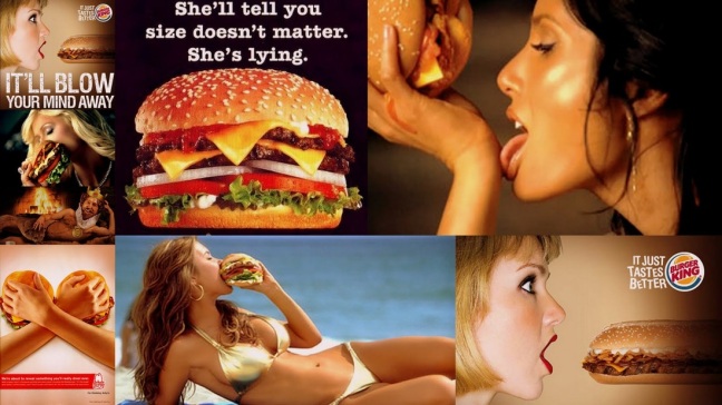
For as long as modern advertising has existed, women’s bodies have been used to sell everything from cars to fast food. The models in the advertisements are being used as a lure to get young men to buy the product (using women as decoration.) Female sexuality, you see, is potent enough to bend men to its will, and the advertisers are hoping that the pretty girl is pretty enough to convince the young man watching to buy the product that has nothing to do with naked women. The biggest culprit I found within the food industry for over sexualising women for consumer based purposes was ‘Burger King.’

Subliminal messaging is when erotic imagery, symbols and words such as ‘sex’ or ‘fuck’ is placed into advertisements without hitting the audience’s conscious mind making you want to purchase the product because lets face it, sex sells. Burger King use subliminal messages in the form of sexualised innuendoes and eluding to the idea of sexual favours. “She’ll tell you size doesn’t matter. She’s lying” Burger King slogan implies they are no longer talking about their burgers but the size of a mans penis which for some reason makes men want to buy the product, maybe to show they have nothing to hide? Strange. “Irresistibly long and beefy” Burger King slogan is another favourite of mine eluding that beyond the length of the poster there is a woman on her knees ‘perfuming a sexual act’ again attracting men to the product with the addition of their famous strap line “Have it your  way.” I have to admit at first glance I found these both quite funny, they are sexual yes, but we have to have a sense of humour about some things. The one I did have a problem with though was the “Gold collection” Burger King slogan depicting a naked woman painted gold. This is another advertisement that falls under the category of unnecessary, it isn’t making a pun or an innuendo like the other two, it is literally a naked woman for the sake of it. You could also argue that the subliminal messaging behind it portrays the woman as some sort of golden trophy implying that when you buy this burger you also win the girl and you turn into the sort of royalty that should have sort of woman hanging off your arm. ‘Buy the product and you might get the girl.’

Throughout my research I was often pointed in the direction of actual foods men and women prefer. I wasn’t surprised to see it followed the stereotypical caveman theory of the man being the hunter and the woman as the gatherer. I decided to do a little research of my own. I simply typed into the search engine “Food for men.” It came up with a few pictures of men smiling and holding up healthy food but also a lot of images portraying steaks and burgers. Whereas when I typed in the same thing for women, the images I got were either women looking almost lustfully at bowl of fruit and salad as well as a lot of chocolate and ice cream. I think this comes down to yet another age old stereotype that when a woman gets dumped or nears her ‘time of the month’ all she does it sit on her sofa sobbing into a tub of ice cream. However, there also seems to be a strong suggestion that chocolate gives a woman pleasure. Is this true?

A few students at the university of Sussex have supposedly proven that chocolate gets us more excited than kisses. They have texted this by monitoring their brain waves and heart beats through both activities. Saying that chocolate melting on your tongue gives a longer lasting ‘pleasure’ than kissing does. However, there is no evidence that says anything about women receiving more pleasure from it than men so why do we aim advertising of chocolate towards women and why do we overly sexualise the product. Magnum, who I touched upon earlier are seen in this advertisement to elude how pleasurable their chocolate ice creams can be. The woman in the ad looks at the height of pleasure with a strap line of “mini size, maximum pleasure.” So far it is the only advertisement of food I have come across that depicts a woman in a sexual light that is actually based at women and might stand a chance at enticing a woman to buy it.


However, with anything good there is always something bad. This specific example from Magnum is a good example of how subliminal messaging can work without objectifying. Unfortunately the same cannot be said about this advertisement for ‘Kitkat.’ Subliminal messaging is powerful enough to make you buy something when you don’t ‘really need it’ but when the spell is broken and we have spotted the message, it can almost have the opposite effect. With the implications of this ad not being very subtle, it could have the undesired effect for the company and massively see a decrease in their sales. You have to ask yourself why a company thats main client is apparently women would use an ad and strap line as crude as this.

“When women’s bodies get displayed on film for men to enjoy, they’re displayed for a very specific purpose: to sell men on the idea that they can have, own, and enjoy the woman on display. This is why the word objectification exists. To describe the phenomenon that reduces women to mere parts and equates them with objects that can be possessed and displayed, like prizes.” MsCinephile blog 4.22.14 Girls (and boys) on film 

bradley-coooper-ad-campaign-haagen-dazs-ice-cream

I have looked an awful lot into the idea of how women are portrayed in food advertisements over the priority of men because I feel the symbols are not the same. Although this advert of Haagen-Dazs caught my eye. It is one of the only examples I found where a brand is using a man to sell their product to women. Furthermore it is not just an ‘attractive’ man, it is an attractive, wealthy and successful man that we are all familiar with. Usually brands are very careful about doing this. By giving your brand a face you are risking a lot as a company. You will find your clients get used to this face and if it changes you suddenly have unhappy customers. By adding a ‘celebrity’ to the face of your brand, not only are you opening your company up to scandals in the sense that if that celebrity appears poorly in the tabloids it will reflect back onto your company but also in a sense you are de-personalising your brand and essentially making it ‘less accessible’ to the ordinary person.

Ed Culf, the marketing director at General Mills, said: “Bradley Cooper is the first celebrity to appear in a Häagen-Dazs campaign and is a perfect match for the brand, epitomizing class and style.  The 30-second TV ad will roll out on TV channels, including the ITV network and Channel 4, which best appeal to the brand’s target audience of women aged 16-34. It likens ‘The House of Häagen-Dazs’  to fashion brands such as the ‘House of Chanel’”.

The objectification of men within advertising is not equal to that of women because when men are portrayed, the ideas of strength, capability, power and vigour are put forward.  Whereas the same can’t be said about the standard objectification of women, which usually revolves around body parts and  “sexy” images of women usually being relaxed, lying down, finger in the mouth like a child. Submissive, pliant, docile.


Durex have done it again

Durex are the worlds biggest condom company, they have been around 86 years and are showing no signs of yielding. Their products are available in over 150 countries and they produce over 800 million condoms per year. They are a very interesting company to look into and have aways been very successful and somewhat renowned for their effective and beautifully designed advertisements.

Over the past 80 odd years, the logo we know today has barely changed. There is barely anything telling us why the logo is the way it is but I am guessing the smooth outer shape is meant to loosely depict the shape of a condom. The interesting part of the brand however, comes from the story behind the name. Have you ever wondered what ‘Durex’ stands for or how they happened upon this word? In 1929 the ‘Durex’ trademark was registered. Du stands for durability, R means reliable and the EX stands for excellence.


1725244c0a5cd821d30722da10d70282

They are very clever with their advertising is a few different ways. Over the years, we have seen a variety of campaigns be launched by the brand but they are always very careful to keep the brand fairly faceless by using objects and type rather than actual people. The reason they do this is to widen their target audience. If you place a young couple on the brand, older couple will be put off by thinking this brand isn’t ‘for them.’ Sex is a concept that targets literally everyone. By the time you are old enough to know what sex is, condom companies are basing their product towards you. Durex know this and and in a clever way they exploit this. When they use a person in an advertisement, they are careful to only use a small section of their face or body keeping the brand personal to anyone who is seeing it. This is like mirroring, when you look into the advert you see yourself, you are ether target audience.

92563_1_468
XXL campaign, Durex, Advertisements that work

2a101b4363997f720842b5f68c793112


This advert was taken from their ‘XXL’ campaign. A campaign that saw a lot of attention for controversy. Although when you are literally selling sex it is hard not to turn a few heads by being a little rude. It is a well known fact that the more outrageous the advert, the more you will notice it and potentially take it on board. Durex are certainly not shy of upsetting people and over the years have had a few of their television adverts banned due to “being crude.” Their biggest releases in the past five years have included their ‘XXL’ campaign, advertisements on price and their valentines day “shattering the cliches.”

When Durex had a decrease in their sales due to the product apparently being more expensive than other brands, they launched their very clever poster designs depicting the importance of the product whilst also having a little dig at the people who had claimed the price was too high. They are almost saying you need us more than we need you with these designs and it is very clever and executed in a very simple way that is yet again beautifully designed.

Durex is a brand I love because they are not afraid to upset people. They are aware that we no longer live in a world where it is taboo to talk about sex and we are aware that everyone is doing it, the young, the old, the anti social, because why not? Who doesn’t enjoy pleasure. They are a brand who are not only not afraid to push the boundaries of society, but seem to thrive on it. Their latest campaign was released in February of this year just in time for valentines day. It was a new and improved version of the adverts we saw from them the year before.The whole idea is to break the mould, stop buying chocolate and flowers for your loved one on valentines day and give them what they really want…SEX.    Its about “Shattering the cliches this valentines.”

69835_Durex-2015-Valentine-campaign

This is the advert that we saw surrounding valentines day of 2015, again using a well dressed man ‘being romantic’ but being very careful not to show his face, cleverly.

This is the advert we saw this year, taking a whole new concept to valentines day and I am sure ruffling a few feathers in the process. This is a brand that is Durable, Reliable and Excellent. Their campaigns are well thought out, well designed and purposefully controversial. They are here to break the mould with impact and I doubt we have seen the last of them yet. We need them more than they need us and lets face it… SEX SELLS.


The ‘decapitator of East London’

Subvertising is a ‘portmanteau’ of subvert and advertising. It refers to the practise of making spoofs or parodies of corporate and political advertisements. This can be any kind of imagery that essentially ‘takes the piss’ of something that already exists. It is a very big concept among ‘street artists’ for creating controversy and getting people talking about real issues.

London has always been a hub for new and inventive ways of producing graffiti. It has turned from something ugly that people hate to something of substance that depicts a piece of art. Don’t get me wrong, I am not saying that there is no ugly tags of graffiti around the streets because there is. I am saying that when it is done properly, it can be something of great beauty. There are always going to be people that hate it and want it gone but with the uprise of ‘graffiti permitted areas’ we are seeing a significant rise in general talent. With Banksy breaking on to the scene in the 1990’s and Mr Bingo following suit in the past few years, we have seen controversial pun inspired work appear around London.

haitmail04   Banksy-kissing-cop_3094351a

Mr Bingo’s “Hate mail”   Banksy’s “Policemen”     Both Google images

2014 was no exception, it brought as he/she is most commonly known..”The decapitator of East London” onto the scene. This masked artist has taken it upon themselves to create controversy and “right a few wrongs” by ‘decapitating’ the heads of billboard advertisements. ‘The decapitator’ has made his subject “mainstream advertisements.” By eerily removing the heads of famous advertisements and replacing them with gory stumps he has managed to portray as idea that these advertisements are faceless and corporate as well as eluding to the larger concept that we are all followers of society. The most interesting aspect for me is that they are done so well, if you are walking past in a rush you actually might not notice the advert had been tampered with. It is only when you look back or see a stream of them all next to each other that it becomes obvious it is ‘vandalism’ and on a larger scale, a political statement.

2ad004c19aa713cfc6545a02cc6e43c7
Pepsi Max and 7up, The Decapitators ‘flickr’
picture_2.png
The Decapitators Flickr 

“The Decapitator’s culture jamming pieces are reminiscent of the style of popaganda artist Ron English, whose seminal work in billboard subvertising involved covering mainstream advertisements with his own art.”   Jenna Wortham, Wired online magazine

6a00e54ff3d0298833014e8939065b970d
‘Subvertising’ Ron English. Google images

Unfortunately the irony of work like this is could work against them. The reason they are ‘decapitating’ and ‘subvertising’ these images is because they believe such advertisements are faceless. However, by doing this they could actually be giving these “faceless corporate brands” more air time. Is this something they want?


“I’m making a dinosaur…”

Lego as a brand and identity is very interesting to look at an example of development and stability, it is a brand we all know and love but it also has a rich history beyond the colourful plastic blocks. For those reasons, Lego is the company I have chosen to write a case study on.

The Lego Group we all adored as a child (and lets be honest still love as an adult) began in the workshop of Ole Kirk Christiansen who was a carpenter from Billund, Denmark. The brick were originally made from wood in 1932. In 1934, his company came to be called “Lego”, derived from the Danish phrase’Leg godt’ meaning “play well”. In 1947, Lego expanded to begin producing plastic toys. In 1949 Lego began producing, among other new products, an early version of the now familiar interlocking bricks, calling them “Automatic Binding Bricks”.

As the company has developed and expanded over the news, so has the logo. It has transformed drastically to the one we love and recognise today. It is in my opinion, one of the logos you can physically see changed over time due to ageing but more importantly due to money. Thousands of logos change over time but they stick to their colours or the shape of the emblems stays like Coca Cola or Shell. Lego is one of those logos that was really effected by war and poverty. When the brand emerged Hitler was in power and the resources you could get your hands on were scarce resulting in Lego’s first logo being set simply in monotone with no graphics set around it. It is not what you would expect the logo of a kids toy manufacturers to look like.

8234800485_aae57d5c3b_b

As a company after the second World War until today, Lego has remained very playful and clever with their branding. The language they use is friendly and aimed towards children meaning children will be drawn to it and get their parents to buy it for them. Although I am not massively fond of their logo, Lego have some of the most innovative and beautifully designed posters and advertisements. Perhaps this is because I was a lego kid. It is said that if you identify with a brand when you are young, you will still identify with it as you grow up weather you still like the brand or not. It is simply a recognition from your brain that you remember the personal memories that are attached to the brand.

Words-puzzle-LEGO-advertising-2-610x703         Words-puzzle-LEGO-advertising-3-610x703

Their visual language is bright, colourful and innovative, much like the lego bricks themselves. It is such a widely exposed product in the sense that every child has built something with Lego before (even the adults you see walking around today) that essentially it doesn’t need much in terms of branding and advertising. As a company they are very clever in the way they use big bright bold colours to draw in the attention of young children. They use these colours accompanied with few words so children understand what they are looking at. It should also be noted that red and yellow are the first two colours that our eyes recognise especially the keen eyes of little kids. They are also clever to add the Lego logo fairly big at the bottom so the parents take it on board for the next birthday or christmas.


legoad5     legoad2


These adverts above were used in the past few years on small billboards and bus stops and they are so effective. The entire product is based on having fun and using your imagination to build whatever you want. It is a big reason the product has always sold so well. By not actually ‘building’ the toy, you are essentially not basing the toy at anyone in particular. Instead you are selling imagination and creativity, you are selling a product that will allow you to make whatever you want even if it doesn’t exist. In a way it is in the same line as play dough but easier, less messy and can be for any age. Lego sell innovation.

lego_ad_16          616d4f368863d602a67b01a1593b261c

We all know that if the product you are selling is for kids, then your marketing is going to be based on that demographic, although the younger the child, the more your advertising needs to also speak to the parents. Something like Lego doesn’t really have an age so appealing to adults is always a good idea. There isn’t much parents like more than their children apart from knowing what they are doing for them is good. So if you think you are giving your children ‘Brainfood’ and teaching them to learn, build and be creative at the same time it would be the product in the shop you would take to the tills wouldn’t it? This is a very clever advertisement aimed directly at the parents that Lego know will ensure more sales.